Falcon City Tennis Championship
Award winning Brand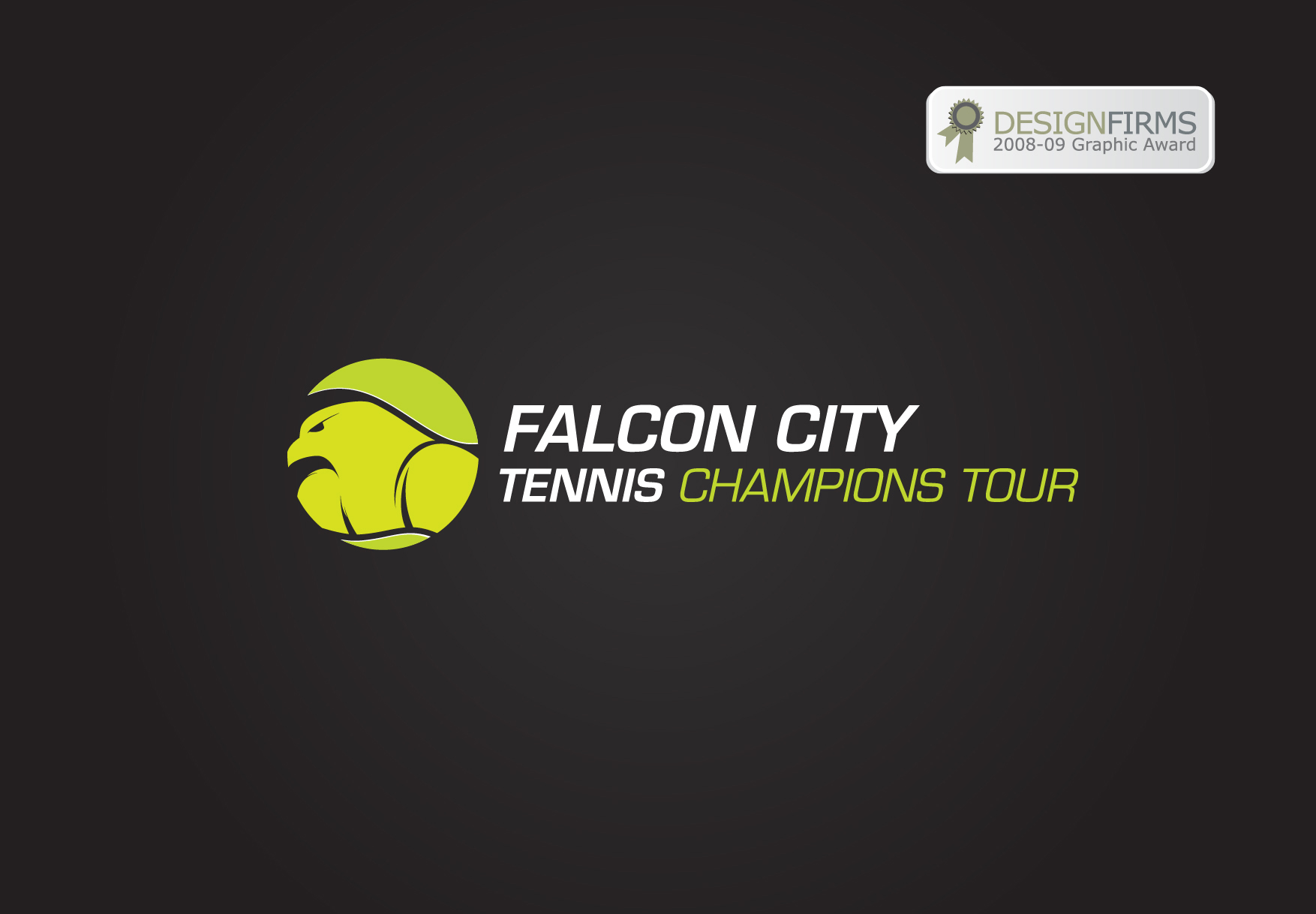
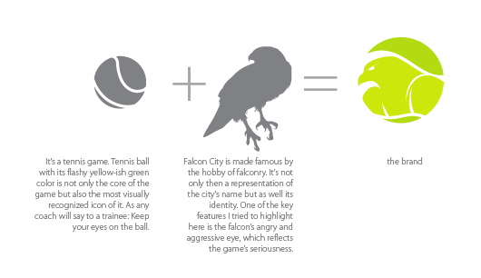
It’s tennis game hype. Tennis ball with its flashy yellow-ish green color is not only the core of the game but also the most visually recognized icon of it. As any coach will say to a trainee: Keep your eyes on the ball.
Falcon City is made famous by the hobby of falconry. It’s not only then a representation of the city’s name but as well its identity. One of the key features highlighted is the falcon’s resilience and strength, which reflects the seriousness of the game.
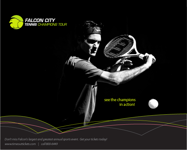
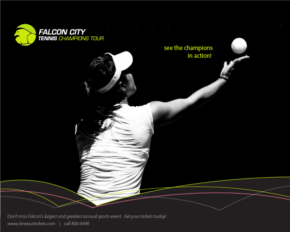
Falcon City Tennis Champions Tour is the biggest sports event in the city. The client wants a brand that reflects the city’s identity and for sure highlight the game. The logo illustrates an angle of the ball displaying a strong falcon head on it. The brand is then more empowered by the high contrast of using the ball’s flashing color directly against black background.
The brand won the DesignFirms logo award.
Services
- Brand Positioning
- Logo Design
- Advertising
- Marketing Materials
CLient
- Falcon City Tennis Championship
Deliverables
- Brand Logo
- Visual Guideline
- Advertsing
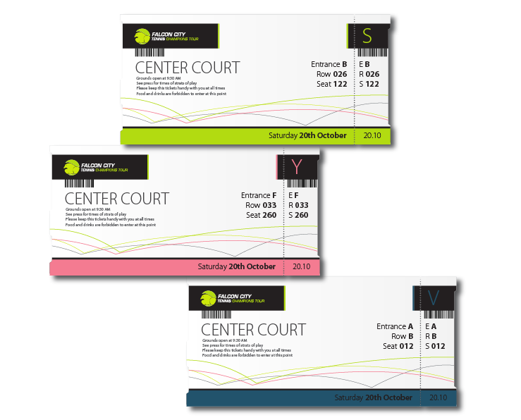
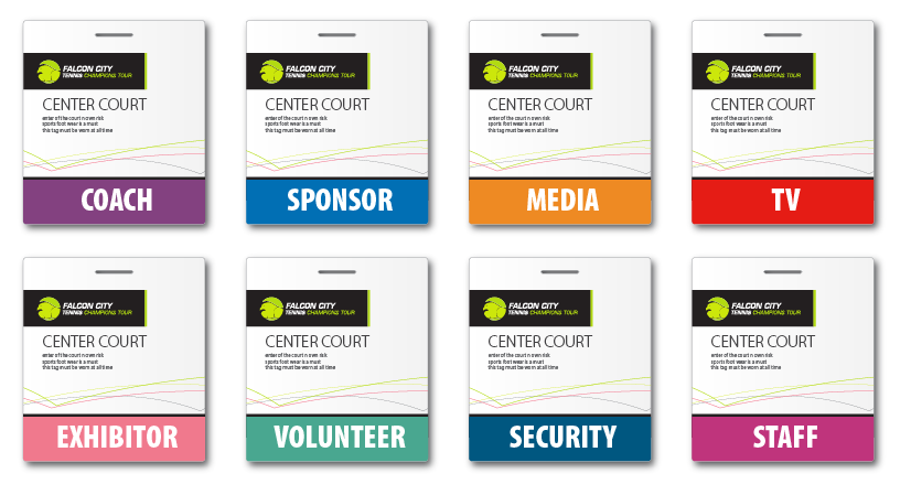
- Tickets & Tags

#CCE70B

#231F20

#F67B92

#C5C5D1

#22526C