Islington Medical Pharmacy
Branding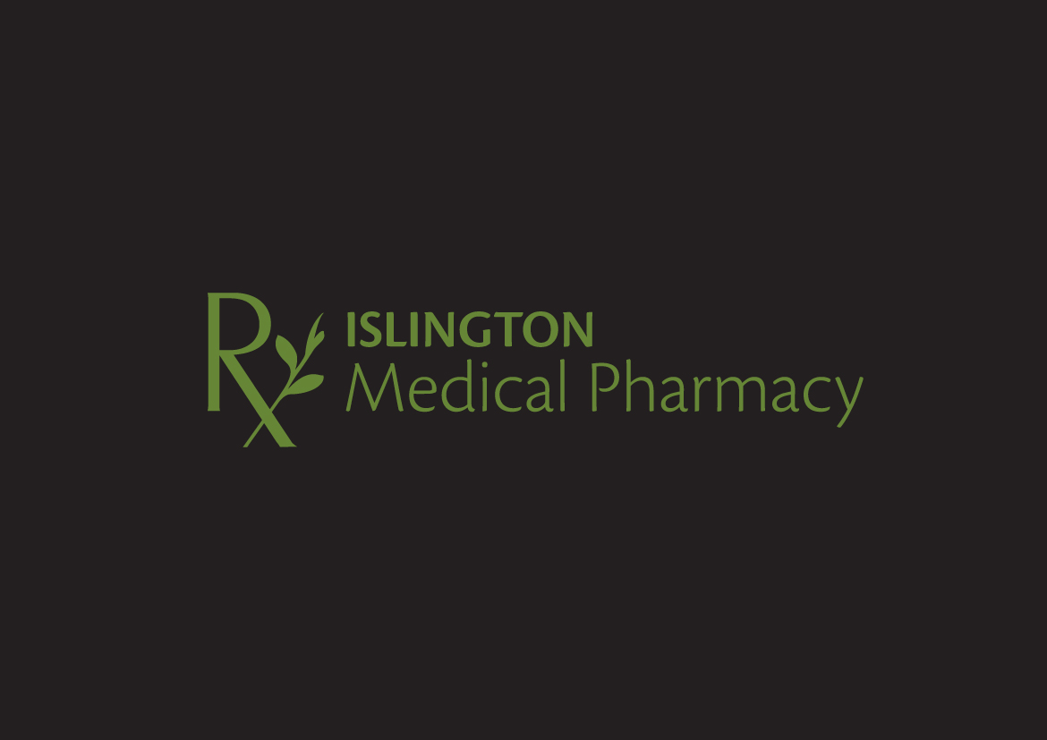
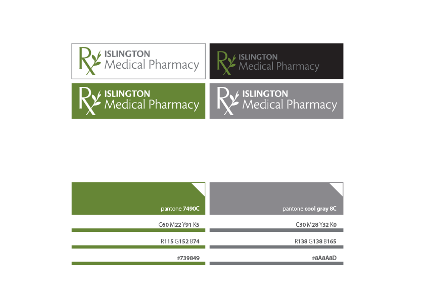
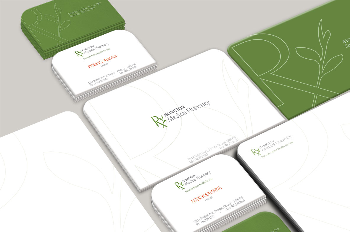
Islington Medical Pharmacy is located in Etobicoke, Ontario. The client approached us to design the brand while having some preferences in mind. As the pharmacy will be located inside a medical building the client wanted the logo not to be mistaken for any other clinics in there. The client wanted both the logo and the typography to be easily understood by the mass, emphasizing on the words “Medical Pharmacy” and on a fairly known symbol like mortal and pestle or anything of the kind.
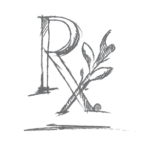
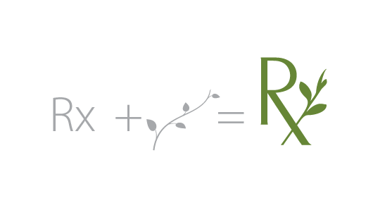
The Rx is a well-known and widely used symbol for medical prescriptions. Almost everyone around the country can easily read this symbol as a representation of medicine refills.
Using the stem of a plant gives the idea that this pharmacy will be producing its own compounds. As well, the usage of the plant stem reflrects good health and well-being.
Services
- Brand Study
- Logo Design
- Marketing
CLient
- Islington Medical Pharmacy
Deliverables
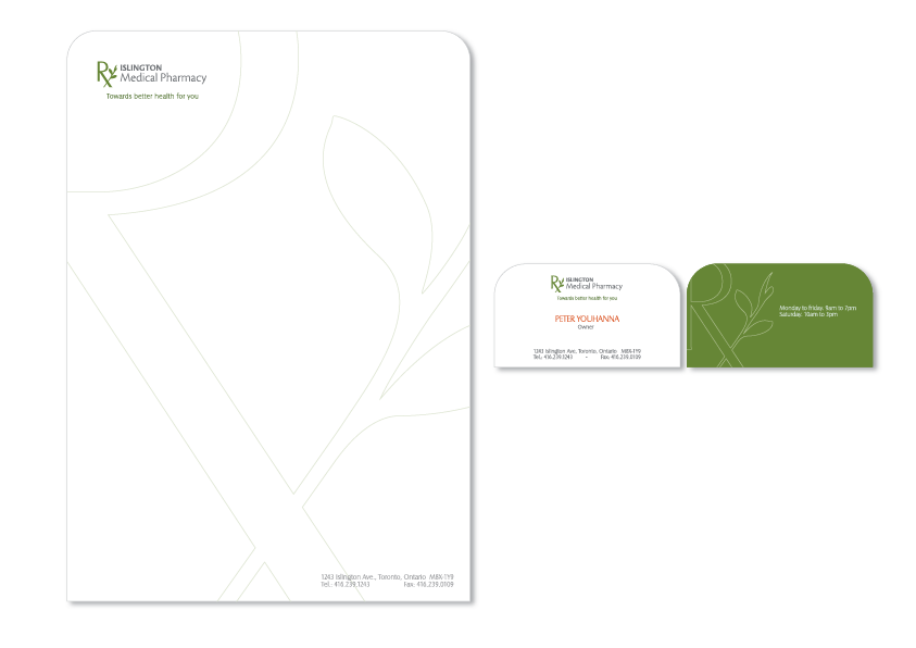
- Brand Logo
- Advertising
- Printed Materials
- Window Clading